Navigating in OTR Administration
OTR offers many tools for the taxpayer to navigate and enter data. The following section lists the navigation buttons and icons available in OTR.
Navigation buttons allow to perform various operations. They usually carry the wording describing the action attached to it. For example, Text Definition, Configuration tierce, etc.
The navigation buttons allow you to perform various operations.
- The Save button saves your entries. This action is usually accompanied by a message confirming that the registration was successful;
- The Create button creates content, e.g., adding an address, etc. Typically, clicking on this button opens a page or pop-up window that allows you to enter content;
- The Cancel button cancels the last action. Clicking this button cancels the action and redirects you to the original page. In some cases, clicking on this button also displays a confirmation window prompting further confirmation;
- The Previous and Next buttons direct you to the next or previous page, as appropriate;
- The Delete button makes the entry disappear. Clicking this button opens a confirmation window allowing you to confirm the deletion;
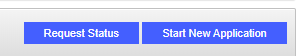
- Specific buttons may also be available to the user, as appropriate. For example: Close, Modify Profile, Request Status, Sign Up, Start New Application;
The navigation icons are pictograms allowing to launch an action.
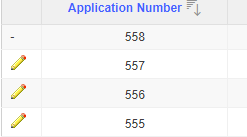
- The pen icon indicates that you can edit content. Clicking on the icon redirects the user to the requested page or pop-up window. The user can then modify, save or delete the entries if these options are available;
The radio button allows you to choose an option among other options. Clicking on this button selects the chosen option.

The check box allows you to make a choice. A click on a check box either checks or unchecks the box.
The input fields are used to enter text, select a date, etc.
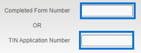
- The text field or input field allows you to enter text. Depending on the case, the accepted values are numeric, alphabetical or alphanumeric;
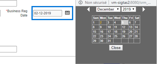
- The date field allows you to select a date. The user can (1) manually enter the year, month and day in the format shown, or (2) click on the calendar icon and choose the date. The user can then directly select a date in the calendar. He can use the arrows to the left or right to access different months of the year. By default, the calendar shows the current date, displayed in the format DD-MM-YYYY. To change the date, the user can navigate through the calendar or change the date indicated in the field reserved for this purpose.
