Navigate Workflow
Workflow offers many tools that make it easy for the user to navigate and orient themselves. The following section lists the navigation modes, buttons, and icons available in Workflow.
The menu or drop-down list allows you to select one or more options. Clicking on the drop-down menu displays a list of values.
The hyperlink (usually identified by the pale blue color) allows the user to open a new web page.
Navigation buttons
The navigation buttons allow you to perform different operations. They usually have the label describing the operation attached to them and are located at the top or bottom (left/right) of your screen, depending on the type of action to be performed. For example:
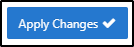
- The button Apply Changes (bottom right) save your entries. Usually, this action is accompanied by a message confirming that the registration was successful.
- The Create button, as its name suggests, adds content, for example, creates a new procedure, adds a new message, etc. Typically, clicking this button opens a page or pop-up allowing you to enter content.

- The Cancel button (bottom left) undoes your last action. A click on this button invalidates the action and directs you to the original page. In some cases, clicking this button also displays a confirmation window to confirm the cancellation.

- The Delete button (bottom left) clears the entry. A click on this button opens a confirmation window allowing you to confirm the deletion.

- The Refresh button confirms the entries and displays the data according to the selection criteria applied.

Navigation icons
The navigation icons are pictograms that allow you to take action, for example:
- The pen-icon (on the left) indicates that you can edit content. Clicking on the icon redirects the user to the page or pop-up that is the subject of the request. When these options are available, the user can edit, save or delete the entries.

- The search icon (magnifying glass on the left) allows you to choose from several options. This icon is usually accompanied by a text field that allows you to refine the search. Clicking on this icon displays a list of values.

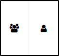
- The assignment icon(s), as the name suggests, is used to assign a task. Clicking on this icon opens a pop-up window or confirms the assignment as appropriate.
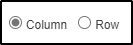
The radio button allows you to choose a single option from several options. Clicking on this button selects the chosen option.

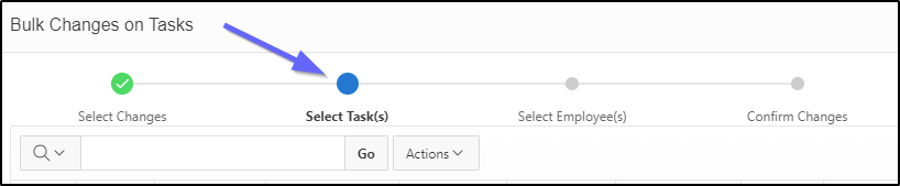
The navigation train allows you to perform a specific operation. When the radio button is blue, it tells you which stage you are in.
Input fields
Input fields allow you to enter text, select a date, and more. For example:
- The text field or input field, allows you to enter text. Depending on the case, the accepted values are numeric, alphabetic or alphanumeric;

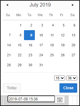
- The date field selects a date. The user can (1) manually enter the year, month and days in the specified format, or (2) click on the calendar icon and choose the date. Clicking on this icon opens the calendar. The user can then select a date directly on the calendar. They can use the left or right arrows to access the different months of the year. By default, the calendar shows today's date and is displayed in the format DD-MM-YYYY. To change the date, the user can navigate through the calendar or change the date indicated in the field provided for this purpose.
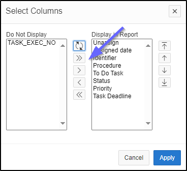
The direction arrows allow you to select/deselect values as appropriate. Clicking the arrow moves items from left to right or vice versa.
The checkbox indicates a choice. Clicking on a box checks or unchecks a selection.