Navigating in e-services Public
e-services Public portal offers many tools for the user to navigate and enter data. The following section lists the navigation buttons and icons available in e-services Public.
The menus are always accessible in the tool bar located in the top of the page, regardless of where you are in the application. Clicking on the desired menu displays the page coresponding to your selection.
 Some pages also contain different tabs to access different submenus. A click on the tab opens the appropriate page.
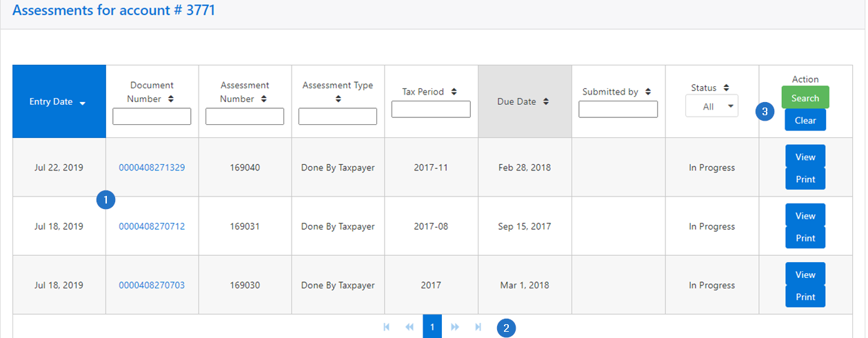
The page contains the following elements:
- Each page displays a list of items that match your selection. For reasons of coherence and clarity, the lines in the table are alternated in white and gray. However, no action is possible here;
- The rightward arrow allows to access subsequent selection, while, the leftward arrow allows to return to previous selections;
- The color of the buttons allows you to better identify the action to be performed.
 The navigation buttons allow to perform various operations. They usually carry the wording describing the operation attached to it. For example:
- The Account Report button. A click on this button open a dialog box allowing to select start and end dates. This button is available on the Accounts page.
- The Cancel button. A click on this button cancels your selection and redirects you to the original page. This button is available on all pages where data is entered;
- The File button. This button is used to submit declarations or withholdings. This button is available on both Declarations and Withholdings pages;
- The View or Details buttons. A click on this button display details;
- Specific buttons may also be available to the user, as appropriate. For example: Upload CSV, Download Template, Reply, Resend activation, Show or Hide column options, etc. As stated earlier, some buttons are colored as to better identify the action to be performed.
The navigation train (sequence) is used to perform a specific operation. When the button is displayed in blue, it indicates your current stage.
 The navigation icons are pictograms allowing to launch an action:
- The Check box allows to make a choice;

- The Direction arrows are used to select values. Clicking on the arrows moves items from left to right, from top to bottom or vice-versa;

- The Message icon provides access to the internal message service. The number of new messages is displayed. The default value is 0. Clicking on this icon opens the mailbox;
- The Question Mark icon. A click on this icon displays extensive help;

- The Search icon (magnifying glass) allows to choose from several options. This icon is usually accompanied by a text field permitting to refine the search. Clicking on this icon displays a list of values.

- The input fields are used to enter text, select a date, etc.;
- The text field or input field allows to enter text. Depending on the case, the accepted values are numeric, alphabetical or alphanumeric;

- The date field allows to select a date. The user can (1) manually enter the year, month and day in the format shown, or (2) click on the calendar icon and choose the date. The user can then directly select a date in the calendar. He can use the arrows to the left or right to access different months of the year. By default, the calendar shows the current date, displayed in the format DD-MM-YYYY. To change the date, the user can navigate through the calendar or change the date indicated in the field reserved for this purpose.
